Faking It: The Freedom of Fine Art
Contrary to documentary photography, fine art doesn’t have to document reality. Think of it as painting — only instead of brushes and oils, you use a camera and editing software. You can do anything you like, even build a fantasy world if you wish. The key difference is intention.
As I wrote in my previous article (Faking It: When Art Pretends to Be Truth), the line isn’t about what you do — it’s about what you claim. If you call your image fine art, you’re free to interpret reality. If you call it documentary, you owe the viewer truth.
So in this post, I want to share my own approach to fine art photography — what I do and don’t do, and why. I’m not offering rules, just thoughts that might help you define your own boundaries with confidence, without asking yourself, “Have I gone too far?”
And just to be clear — everything below refers to fine art photography, not documentary.
What I Do (and Why)
1. Colour grading to create atmosphere
I often colour grade my images to recreate the mood I felt — or imagined — while photographing the scene. Sometimes this means turning ordinary daylight into the warmth of sunset, or cooling tones to evoke early morning calm. Colour grading, for me, isn’t just correction; it’s translation — a way to express emotion through light and tone.
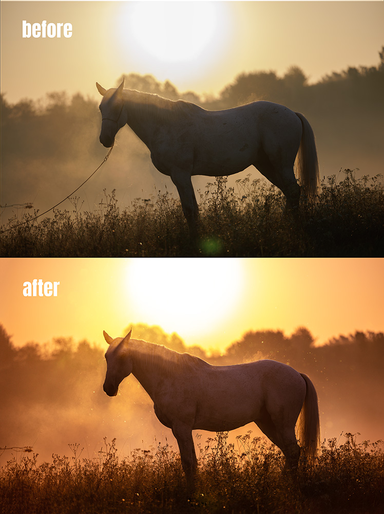
Colour grading
2. Removing distractions
Halters, fencing, power lines, the odd bucket in the corner — all gone. And yes, handlers too. It’s not always possible (or safe) to photograph horses running completely free, especially stallions. So we often work in contained spaces, and I remove what breaks the illusion of freedom — what doesn’t belong to the story.
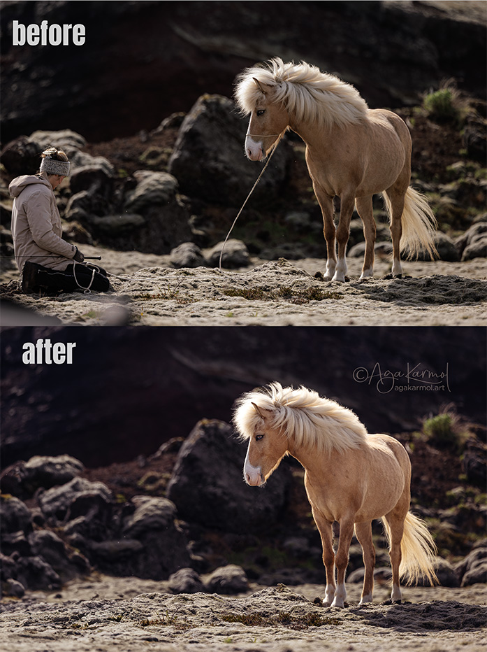
Removing distractions
3. Editing backgrounds for a painterly mood
My art draws inspiration from Old Masters paintings — chiaroscuro, depth, atmosphere. I often edit backgrounds to evoke that painterly feeling, to turn chaos into harmony.
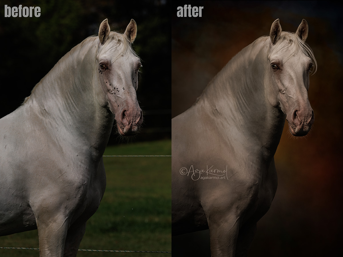
Painterly Background to achieve “old masters” look
4. Adding dust or texture
Sometimes I’ll add more dust, a hint of dirt, or subtle haze to emphasise energy and motion. It’s a visual metaphor for life and power — the kind of cinematic touch you might find in a painting, but still rooted in the reality that was there. Horses are powerful, earthy beings; a little grit reminds us of that.
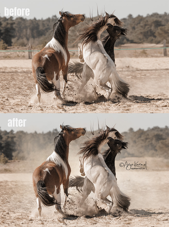
Adding dust to enhance the sense of powerful action.
5. Beauty editing for horses
I do what I call a horse beauty edit — similar to retouching human portraits. That means removing small blemishes, scratches, dirt patches, or temporary marks on the coat, and occasionally restoring missing strands of hair. It’s not about changing the horse’s conformation or character, but presenting them at their best — the way they truly look on their best day.
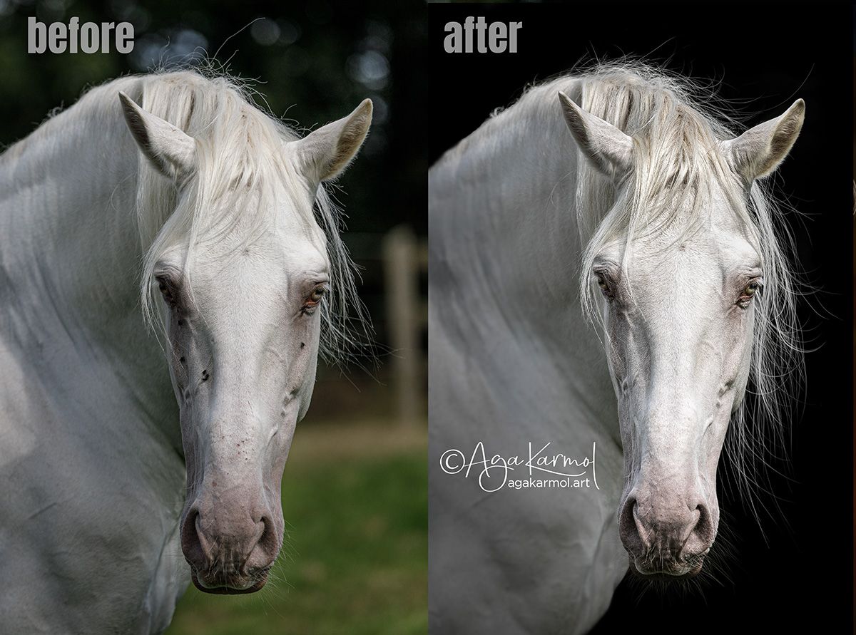
Beauty edit: removing dirt, flies, temporary scars etc.
What I Don’t Do (and Why)
1. No AI-generated objects
Even when I use AI-assisted tools for object removal, I only use them for clean-up — never to add new objects. The software fills gaps with surrounding textures (grass becomes more grass), but I don’t ask it to create buildings, rocks, beaches, or water ponds that never existed in that location.
2. No fake locations
If you see a horse standing before a medieval castle in my image, that’s because I actually went there. Electric lines or stray objects might be removed, but the horse was photographed in that very place. This is my philosophy — and one of the reasons I travel for photoshoots. I would never trade real air, real light, and real ground for a fabricated backdrop. I prefer to find genuine spaces that carry atmosphere naturally, without having to fake them.
3. No composites
I don’t build composites in my fine art work. The only exceptions were a few commissioned shots for breeders who wanted several stallions or mares together — scenes that would be unsafe to photograph in real life. But in my fine art images, if you see two stallions touching, they were truly there, in that moment, together. The connection you see is real.
4. Rarely swapping skies
Swapping skies has become a trend, but it often fails spectacularly. You’ll see a galloping horse under a sunset sky — yet the light on the horse is flat, with no warm glow, no golden reflections, no colour cast. Because the light you see in the sky simply wasn’t there. If the light doesn’t match, the magic dies. So I very rarely replace skies, and if I do, I choose one very similar to the real one — often from the same scene, just captured with different settings.
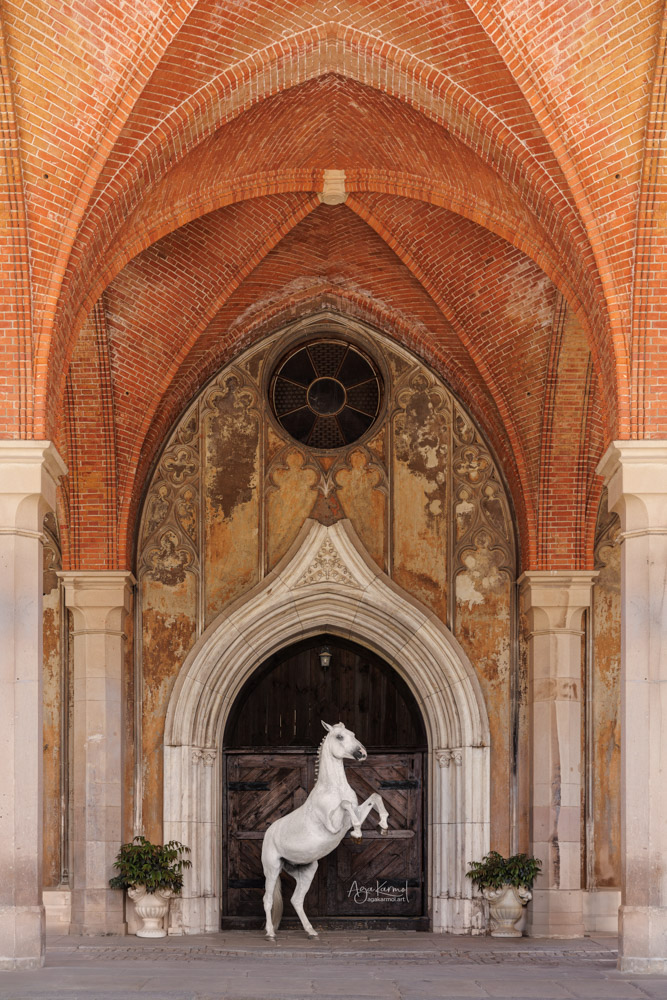
I don’t put my models into fake locations. The whole pleasure is to go personally to all those incredible places. Here, the horse is posing for us at the gate to one of many Polish castles
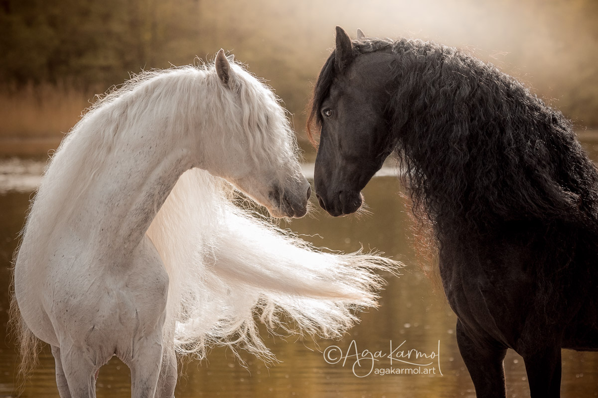
I don’t do composites. The connection is real.
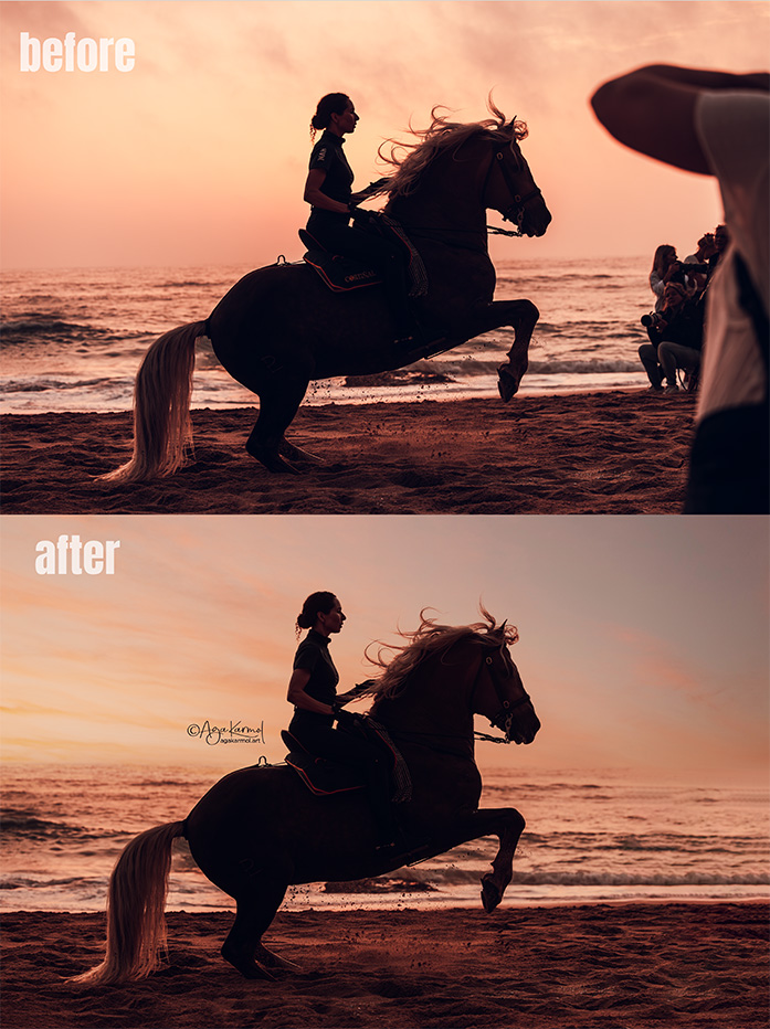
I rarely swap skies and try to keep them realistic.
My Philosophy
I don’t believe my way is the only way — it’s simply mine.
Whatever your approach, remember this: good editing should always look invisible. Even if you build an entire fantasy world, it should feel believable. Light must match. Perspective must match. Masking must be seamless.
Fine art gives us the freedom to imagine — but imagination still deserves craft. When an edit is done well, the viewer doesn’t see Photoshop. They see a story. When it’s done poorly, they stop believing it.
Define your boundaries, create with honesty, and let your edits serve your story. Because faking it — when done with intention — can still be profoundly real.
If you enjoyed this article, learned something new, or it simply sparked a bit of curiosity — you’re welcome to buy me a coffee.
I’ll happily sip it while writing the next piece to share with you.


 Aga Karmol